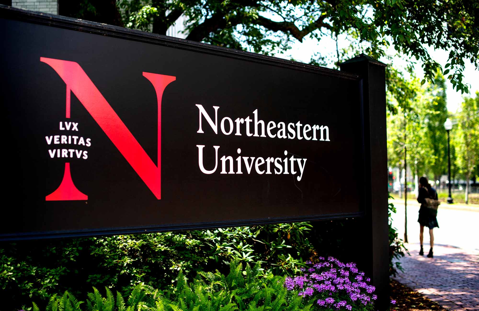
The Wordmark is Northeastern’s primary logo.

Informal

formal horizontal

formal university mark

formal stacked

Primary Type A – Monogram + Wordmark

Primary Type B – N Motto + Wordmark

Informal

formal horizontal

formal university mark

formal stacked

Primary Type A – Monogram + Wordmark

Primary Type B – N Motto + Wordmark

Informal

formal horizontal

formal university mark

formal stacked

Primary Type A – Monogram + Wordmark

Primary Type B – N Motto + Wordmark

Informal

formal horizontal

formal university mark

formal stacked

Primary Type A – Monogram + Wordmark

Primary Type B – N Motto + Wordmark
General Guidelines
Formal University Mark

The Seal lockup is our official mark.
Primary—Type A

The first, umbrella brand combines Northeastern’s Wordmark and the Monogram. This version is the most flexible and works in both small and large sizes.
Primary—Type B

The N + Motto lockup is a graphic, bold variation of the standard lockup. While preferred for increased visual interest, this version works best in larger formats. Please note: This version works best in print and must meet minimum size requirements in digital and print spaces.
Informal Horizontal

The informal Wordmark has limited use for audiences who are already familiar with our organization.
Minimum Size
All University Wordmarks can be sized down until the height of the “N” is 15 pixels high in digital environments or 1/8 of an inch in print environments.
Clear Space
Primary—Type A
Primary—Type B
The clear space below and above the Wordmark Primary A or Wordmark Primary B should be equal to the height and width of the N.
Formal Stacked
Formal Horizontal
Informal
Clearspace around the horizontal, stacked, and informal Wordmarks should equal the height and width of the N in Northeastern. No graphic elements or type should appear inside this zone.
Formal University Mark
The safe zone around the lockup is equal to half the Seal’s height.
Usage
Only the primary brand colors are permitted.
Do not warp or stretch the Wordmark.
Do not add special effects to the Wordmark.
Do not place the Wordmark on busy backgrounds.

Do not tilt or rotate the Wordmark.
Do not combine the Wordmark with any other marks.