Digital experience standards
Our digital experiences—including websites, mobile applications, user interfaces, and social media—should be seamless for users, no matter where they find us.
We work closely with partners in University Communications and Information Technology Services (ITS) to tell a consistent Northeastern story and ensure the best user experience possible.
Strategic guidance
University Marketing provides expertise in web strategy, user experience, and design.
Sites at Northeastern
Groups across the university can build sites using templates offered by ITS. They offer development and technical support for sites hosted on CampusPress.

Web support
Support for websites is provided by ITS and can be requested by submitting a ticket via ServiceNow.

Social media
Overseen by University Communications, find best practices, avatar guidelines, and more here.
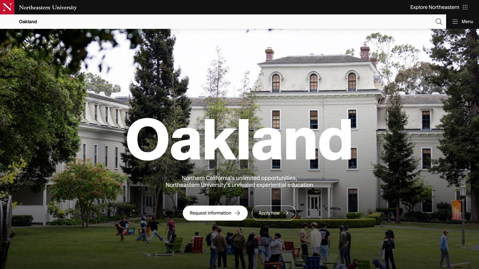
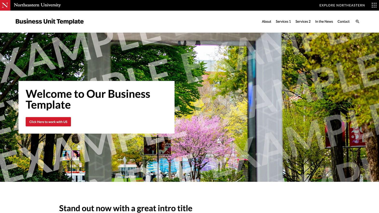
Websites
Your site is part of something bigger — the Northeastern story. Before you update an existing site or launch a new one, connect with University Marketing. We’ll help make sure your project is set up to succeed: strategically aligned, built on best practices, and ready to make an impact.
Please note: University Marketing approval is required for all digital and website contracts prior to the start of work. All new web projects, updates, and creative assets should be sent to [email protected] for review prior to the intended launch date.
Design elements
Color
Color use should align with core brand guidelines.
Do not overuse red. Use red as an accent color to add emphasis. Use it to highlight important elements within designs and areas of interaction, like button highlights.
Review Accessibility below for color contrast guidance.
Typography
Primary typeface:
- Real Head Pro (FF Real Head) is the primary typeface for all digital platforms.
- University Marketing provides a license for use of 10 weights on websites:
- FF Real Head Regular, FF Real Head Italic, FF Real Head Bold, FF Real Head Bold Italic, FF Real Head Medium, FF Real Head Medium Italic, FF Real Head Semilight, FF Real Head Semilight Italic, FF Real Head Light, FF Real Head Light Italic
- See Typography guidance for more information.
Alternative typeface:
- Lato is an acceptable typeface for digital platforms when FF Real Head cannot be used or if Lato is already in use within existing designs.
- While FF Real Head is preferred for new projects, you may use Lato for both headings and body text in current implementations.
Headers and footers
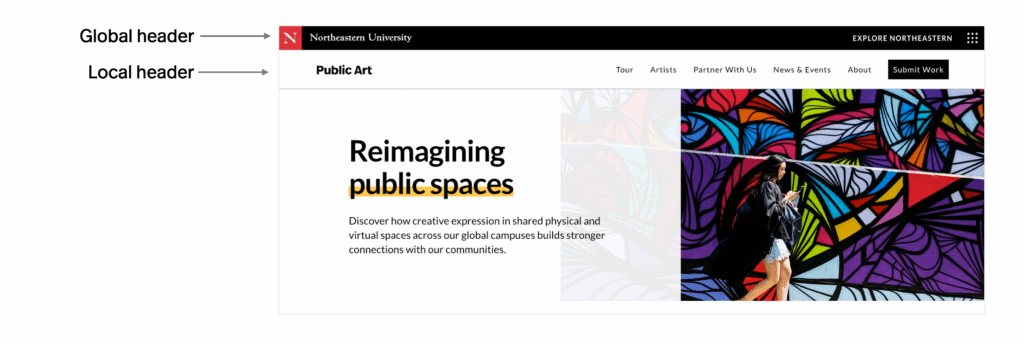
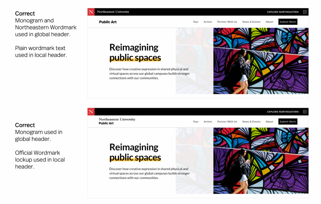
Global header and footer
Standardization
- Websites for official university entities should use the global header and footer.
- Do not remove or alter the global navigation.
- You may remove the Northeastern Wordmark from the global header if using this in the local header.
- Do not remove or alter the Monogram.
- For help, please reach out to IT Services.
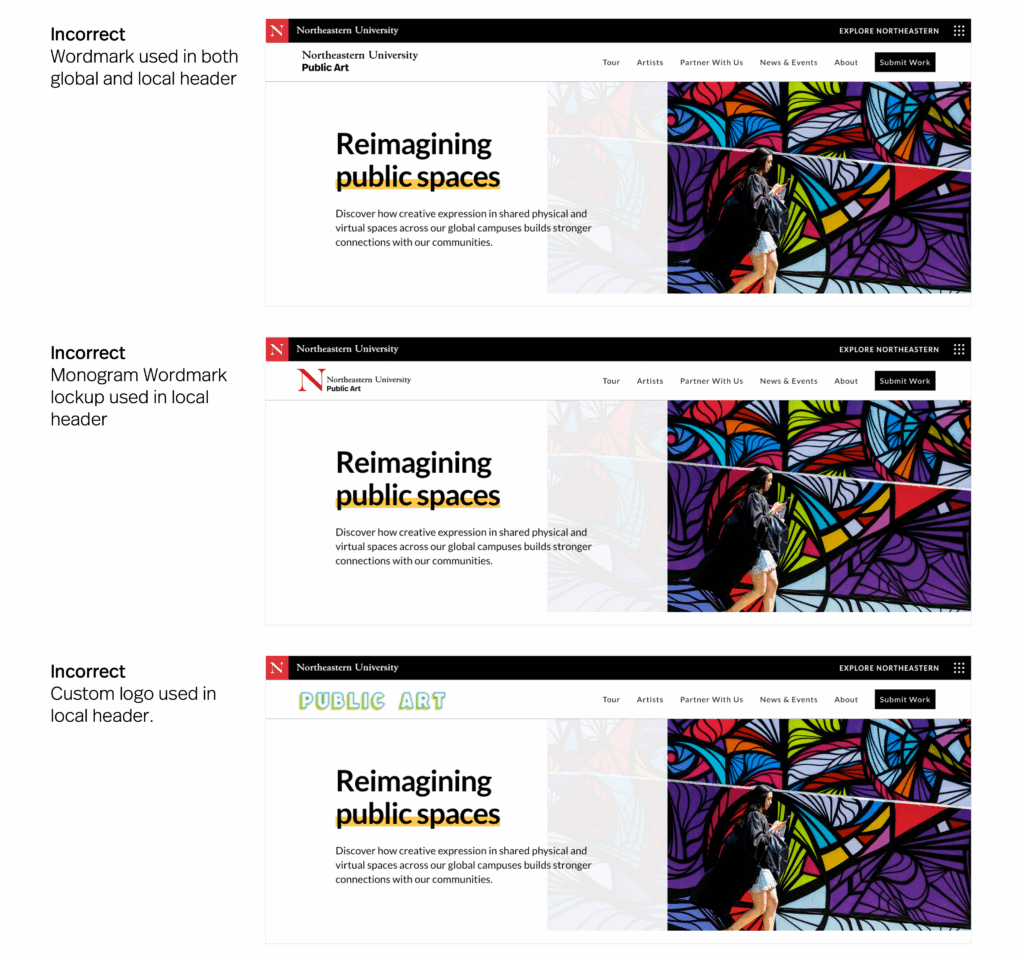
Local header and footer
Standardization
- Use the official Northeastern University logo in either the global header or local header. Do not use this logo in both locations.
- Do not use a Monogram Wordmark in the local header as the Monogram is already present in the global header.
- Do not use custom logos in the local header. If no official logo is available, a site identity logo may be created with our generator.
- Do not use abbreviations in local headers.
- The maximum line height for logos in local headers is 13px for a one-line mark. For two lines, it’s 38px.
Headlines

Set off headlines with H tags in decreasing size to guide the reader’s attention and maintain visual structure. Ensure font sizes are consistent across similar levels for a cohesive and balanced design.
Use sentence case for all headlines, with all-caps reserved for eyebrows only.
The maximum length of H1 headers is 30 characters; the maximum length for H2 headers is 75 characters.
Buttons
All buttons and call-to-action (CTA) elements should follow standards used on the main northeastern.edu sites. This includes color, shape, typography, and hover effects to ensure a cohesive user experience.

Imagery and photo treatments
Consistency
- Use high-quality images that reflect the university’s dynamic community. Images should convey the vibrant atmosphere and cultural breadth that Northeastern embodies. See our photography guidelines for more information.
Photo style
- Squared corners: Images should have squared corners for a clean and professional appearance.
- Treatment: Any photo treatments, such as filters or overlays, should be consistent across sites for a unified look.
Subject matter
- Focus on innovation and academic excellence in imagery choices. Select subjects that resonate with the university’s values and include students and faculty of all backgrounds.
- Emphasize images that show people working together or being together, highlighting the collaborative and shared nature of the university experience.
- Limit the use of images of single individuals, as the Northeastern experience is best represented through community and collaboration.
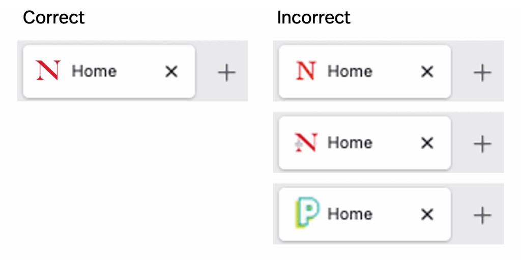
Favicons
Please ensure all favicons for official Northeastern University sites use our Monogram in the color red.
Please do not use any other monograms or icons in this location.
Best practices for content
Information hierarchy
Ecosystem awareness
Avoid using internal team structures as a way to organize website content. Instead, think about how your site and content fit within the overall northeastern.edu ecosystem.
Visitors often navigate across multiple sub-sites before and after visiting yours, so ensure your content contributes to a seamless and unified experience.
Avoid duplication
Link to Northeastern-owned sources or authoritative third-party sources, such as major news sites rather than copy existing content onto your website. This reduces redundancy, mitigates risk of plagiarizing, and promotes trust in the accuracy of the information.
Audience-centered approach
Prioritize the needs of users by guiding them intuitively toward their goals, such as finding programs, applying, or exploring opportunities. Keep their experience central to all development decisions.
Clarity and flow
Structure your content so it’s easy to navigate, presenting key information first and following a logical progression from overviews to details. Use clear headings and concise text.
Navigation
Consistency
Ensure navigation is intuitive and uniform across all sites, adhering to a common hierarchical structure that aligns with Northeastern’s overall digital strategy. This will be assessed during brand review.
Hierarchy
Use a clear hierarchy in navigation menus to guide users efficiently through the site’s content. Ensure easy access to primary navigation and ensure that secondary navigation supports the user journey.
Accessibility
Navigation must be accessible, following best practices for usability and WCAG standards. This includes clear labeling, keyboard navigation support, and proper semantic markup. See Accessbility below for more information.
Brand messaging
Alignment with values
All digital content should reflect Northeastern University’s core values, mission, and strategic goals. This includes the language, tone, and messaging used across websites, social media, email communications, and digital advertising.
Consistency
Ensure that all of your digital content conveys a coherent, consistent message that resonates with our target audiences and supports the university’s objectives. See our guidance on writing for specific channels.
Brand review and approval
What we review
All content will be reviewed for alignment with Northeastern’s brand messaging. This includes verifying that the language, tone, and key messages accurately reflect the university’s values and strategic goals.
Final approval by University Marketing is required prior to the publication of any sites or changes.
Process and timeline
We highly encourage reaching out to University Marketing for periodic reviews throughout the development of your site. This ensures brand alignment early on and helps to prevent delays.
When ready, send an email to [email protected] with a link to your site and a brief overview of the purpose, intended audience, and any other relevant background information.
The University Marketing team will provide feedback within two weeks. We can often provide feedback faster on rush requests, dependent on the number of competing projects.
Please ensure your project planning includes time to implement any requested changes following our review.
User interfaces and applications
Technology platforms, user interfaces and software applications that can be customized to our brand should follow our guidelines wherever possible, including logo use, color, and typography.
What this covers
This guidance applies to any digital product or platform where Northeastern has the ability to apply brand customization, including but not limited to: learning management systems (such as Canvas or Blackboard), student and employee portals, mobile applications, event registration platforms, survey tools, CRM interfaces, email platforms, third-party software with white-label or theming options, and internally developed tools and dashboards.
Logo use
Where possible, use the university’s main marks – Primary Logo, Wordmark, or Monogram.
Do not use athletics marks or unit-specific logos in place of the Primary Logo unless the platform is explicitly for that unit’s use.
Color
Conform to university color guidelines when customizing platform themes, button styles, header bars, and navigation elements.
When platforms limit color customization, prioritize applying the brand color to the most prominent interactive elements—such as primary buttons, links, and header backgrounds—before secondary surfaces.
Avoid using off-brand colors sourced from the platform’s default theme when brand-compliant alternatives are available.
Typography
Real Head Pro is the preferred typeface for Northeastern-branded interfaces. Lato is an acceptable alternative where available.
Where custom font loading is not supported, use sans-serif system fonts rather than decorative or serif alternatives. Do not use condensed, italic, or novelty typefaces as defaults.
See Typography for more information.
When full customization isn’t possible
Some platforms offer limited theming options. In these cases, apply brand elements in the order of priority below, customizing as many as the platform allows:
- Logo / header identity
- Primary action color (buttons, links)
- Typography
- Secondary colors and background treatments
If a platform cannot be customized meaningfully to reflect the Northeastern brand, it should not be presented as a branded Northeastern experience. In those cases, provide clear Northeastern context through surrounding communications (emails, landing pages, instructions) that establish the institutional identity before users enter the platform.
Mobile applications
Mobile applications created or owned by Northeastern University must conform to brand guidelines. Other applications supporting university functions, but not owned by the university, should follow guidelines wherever possible.
All applications should be submitted for a brand review prior to deployment.
Application icon identities
Mobile apps owned by the university should work with University Marketing to either apply the icon identity strategy or determine whether an exception is appropriate for the use case.
| App type | Details | Icon type |
|---|---|---|
| Primary applications | Limited use. Should be reserved for overarching applications or campus locations. |  |
| Significant unit and external-facing applications | For colleges, schools, research institutes and centers, academic units like admissions, and events. |  |
| Student-facing and internal support applications | To include student programs like orientation and services like package lockers. |  |
| Athletics | To include varsity-level athletics and rewards programs. |  |
Design
Applications should adhere to guidelines for color, typography, and logo use wherever possible. Exceptions should be discussed with University Marketing early on in application development.
Accessibility
All UI customizations must meet WCAG 2.1 AA accessibility standards at a minimum.
For training and access to accessibility information specific to WordPress, please visit Accessibility at Northeastern.
Color
Ensure sufficient color contrast between text and backgrounds-a minimum ratio of 4.5:1 for body text and 3:1 for large text (at least 18 pt / 24 pt or bold and at least 14 pt / 18.5 pt).
User interface components (including focus indication and boundaries) and graphic objects should have a minimum ration of 3:1.
Use the chart below to check contrast for our brand colors. For other colors, use this free tool to ensure you meet minimum requirements. Do not use AI tools to check contrast as these may not capture colors accurately.
Hex codes for our brand colors are:
Black | 000000
White | FFFFFF
Red | C8012E
Gold | A4804A
| Color combination | Preview | Ratio | AA Pass | AAA Pass |
|---|---|---|---|---|
| Black on white |  | 21:1 | Regular text Large text UI and graphics | Regular text Large text |
| White on black |  | 21:1 | Regular text Large text UI and graphics | Regular text Large text |
| Red on white |  | 5.9:1 | Regular text Large text UI and graphics | Large text |
| White on red |  | 5.9:1 | Regular text Large text UI and graphics | Large text |
| Black on gold | 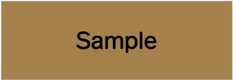 | 5.8:1 | Regular text Large text UI and graphics | Large text |
| Gold on black | 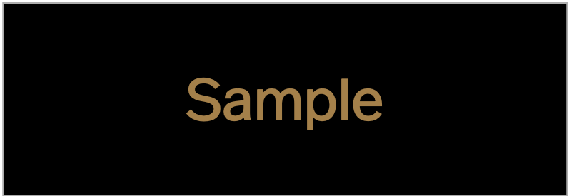 | 5.8:1 | Regular text Large text UI and graphics | Large text |
| Black on red | 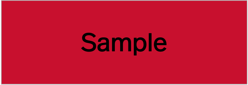 | 3.6:1 | Large text UI and graphics | Fail |
| Red on black | 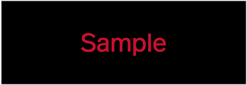 | 3.6:1 | Large text UI and graphics | Fail |
| Gold on white |  | 3.6:1 | Large text UI and graphics | Fail |
| White on gold |  | 3.6:1 | Large text UI and graphics | Fail |
| Gold on red |  | 1.6:1 | Fail | Fail |
| Red on gold |  | 1.6:1 | Fail | Fail |
Typography
Maintain readable font sizes. Body copy should be set at a minimum of 16px, with generous line height (1.5 or more) to support sustained reading. Avoid setting long-form text in all-caps, light weights below 300, or in small sizes against low-contrast backgrounds.
Do not rely on color alone to convey information. Pages and interfaces should use a logical heading hierarchy (H1 → H2 → H3) to support screen reader navigation.
Interactive elements
All interactive elements, including buttons, links, navigation items, and form fields, must have visible focus states for keyboard users. Do not suppress the default browser focus outline without providing a clearly visible custom alternative. Call-to-action buttons should have sufficient size and padding to be easily tapped on mobile (minimum 44x44px touch target).
Media
All meaningful images must include descriptive alt text. Decorative images should have empty alt attributes (alt="") so screen readers can skip them. Video content should include captions, and transcripts should be available for audio-only content.