Iconic colors. A broad range of expression.
Our color palette allows us to create content with a range of tones—from institutional to creative and expressive.
Units should abide by these palettes and may not have independent identity palettes.
Like the proud King Husky, our core brand colors are black and white.
These colors set us apart from our competitors and create a clean background palette for the creative expressions of our brand.
White
#FFFFFF
RGB 255 255 255
CMYK 0 0 0 0
Black
PMS Black C
#00000
RGB 0 0. 0
CMYK 0 0 0 100
Red should be used to reinforce the Northeastern brand.
This color should never overwhelm designs and should be used as an accent with less than 25% of any given design featuring this color.
Red is given greater prominence in athletic applications.
Red
PMS 186 U
#C8102E
RGB 200 16 46
CMYK 0 100 80. 5

Prestigious accents
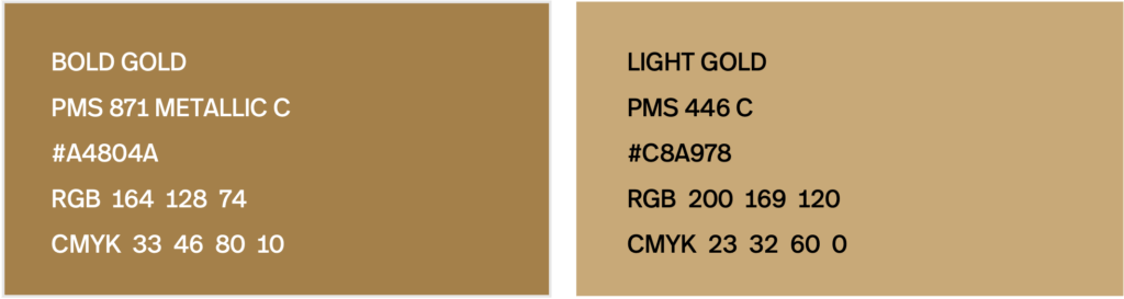
We use gold when honoring prestigious accomplishments and the high caliber of the Northeastern brand needs to shine more explicitly.
It is reserved for special use and should be just 5% of the overall design where used. It is best used in metallic shades in physical formats.
Bold gold
PMS 871 Metallic C
#A4804A
RGB 164 128. 74
CMYK 33 46 80 10
Light gold
PMC 446 C
#C8A978
RGB 200 169 120
CMYK 23 32 60 0
Digital applications
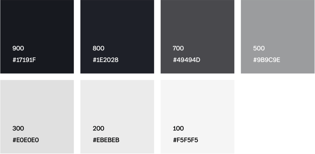
In website and digital design, we leverage a scale of grey tones.
900
#17191F
800
#1E2028
700
#4949HD
500
#989C9E
300
#E0E0E0
200
#EBEBEB
100
#F5F5F5
For more details, see Digital Experience Standards.
Accessibility
All branded activations – including both digital and print – should meet WCAG 2.1 AA accessibility standards at a minimum. See Color ratios below to see contrast standards for our brand colors.
For training and access to accessibility information specific to WordPress, please visit Accessibility at Northeastern.
Color ratios
Ensure sufficient color contrast between text and backgrounds-a minimum ratio of 4.5:1 for body text and 3:1 for large text (at least 18 pt / 24 pt or bold and at least 14 pt / 18.5 pt).
User interface components (including focus indication and boundaries) and graphic objects should have a minimum ration of 3:1.
Use the chart below to check contrast for our brand colors. For other colors, use this free tool to ensure you meet minimum requirements. Do not use AI tools to check contrast as these may not capture colors accurately.
Hex codes for our brand colors are:
Black | 000000
White | FFFFFF
Red | C8012E
Gold | A4804A
| Color combination | Preview | Ratio | AA Pass | AAA Pass |
|---|---|---|---|---|
| Black on white |  | 21:1 | Regular text Large text UI and graphics | Regular text Large text |
| White on black |  | 21:1 | Regular text Large text UI and graphics | Regular text Large text |
| Red on white |  | 5.9:1 | Regular text Large text UI and graphics | Large text |
| White on red |  | 5.9:1 | Regular text Large text UI and graphics | Large text |
| Black on gold |  | 5.8:1 | Regular text Large text UI and graphics | Large text |
| Gold on black |  | 5.8:1 | Regular text Large text UI and graphics | Large text |
| Black on red |  | 3.6:1 | Large text UI and graphics | Fail |
| Red on black |  | 3.6:1 | Large text UI and graphics | Fail |
| Gold on white |  | 3.6:1 | Large text UI and graphics | Fail |
| White on gold |  | 3.6:1 | Large text UI and graphics | Fail |
| Gold on red |  | 1.6:1 | Fail | Fail |
| Red on gold |  | 1.6:1 | Fail | Fail |
